

Outdoor Projects ›
Bedrooms ›
Kitchen ›
Living Room ›
Browse by Room
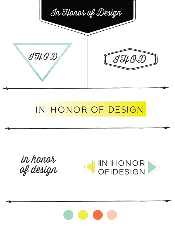
Designing your own logo is by far the most challenging. I love tackling branding projects, but when it comes to my own, I can never stick with a decision. This is why I switch it up almost every year! I consulted my sisters on this one, and am so thankful for their fresh perspective. Here […]
Brand Process: Logo Design Outtakes
Current Projects ›
Other Updates ›
DIY Ideas ›
Renovation Updates
About Us
Shop
Design Guides
Family
Home diys
Renovations
Latest Projects ›
Popular Projects ›
How-tos ›
Home DIYs

Brand Process: Logo Design Outtakes
About Us
Shop
Design Guides
Family
Home diys
Renovations
Outdoor Projects ›
Bedrooms ›
Kitchen ›
Living Room ›
Browse by Room

Brand Process: Logo Design Outtakes

Organizational ideas ›
Activities & games ›
Family favorites ›
Family Updates ›
Family Resources


Brand Process: Logo Design Outtakes
Brand Process: Logo Design Outtakes
About Us
Shop
Design Guides
Family
Home diys
Renovations
Snacks & Desserts ›
Family Dinners ›
Hearty Lunches ›
Breakfast & Brunch ›
Recipes

LAtest guides ›
moodboards ›
resources ›
Design Resources
All Design topics ›

Brand Process: Logo Design Outtakes
Brand Process: Logo Design Outtakes
About Us
Shop
Design Guides
Family
Home diys
Renovations

Our Home Shop ›
favorite Buys ›
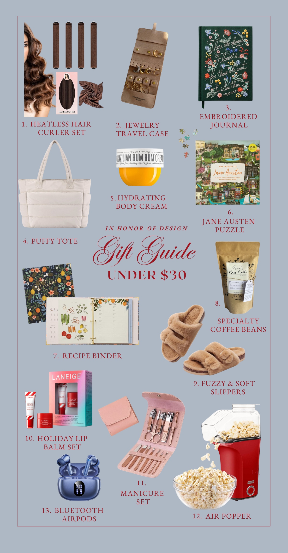
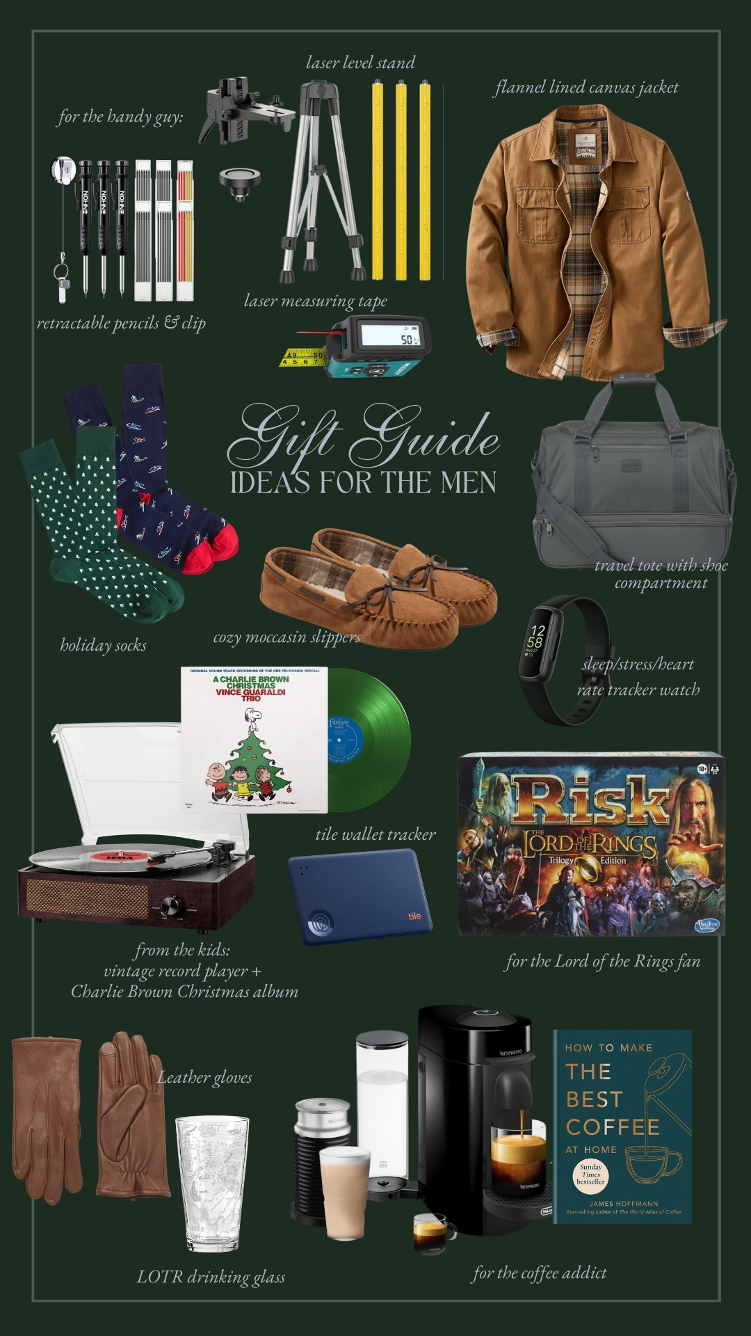
Gift Guides ›
Shop with IHOD
Trending Now ›


Brand Process: Logo Design Outtakes
Brand Process: Logo Design Outtakes
About Us
Shop
Design Guides
Family
Home diys
Renovations


I love black and white with a pop of color. I’m glad you kept your colors, they are so you! I really like the idea of switching between the four for projects. Can’t wait to see more as your rebranding develops. Good luck!
[…] Wow- I’ve been so excited about the launch for IHOD that I could barely keep my mouth zipped! Anna and I have been working together to give her brand and blog a beautiful new look. It’s lovely, isn’t it? (I can’t take all the credit for this one- you can see more about Anna’s logo here.) […]
The arrows and the palette with the white and pops of sherbet looking colors is energetic and fashion forward.
I love your logo, it’s fab!
Ally
says:i love the font you chose and although i liked the color pastel pallet you were working with, the mint triangle is my fav… way to go! what a fun project, you did a great job!
Thanks for sharing this 🙂
Congrats on the new design. I am having a little bit hard time with the posts coming up as thumbnails after the few latest and I’m not that great into navigating without the standard post layout, but I’m gonna get used to it soon 😉
I love the actual blog header logo, but I also love the bottom left. If you added the green/mint triangle on the background of the type it would look great on the blog too. Love the idea of using different ones for different purposes though. I always used to do this as I couldn’t decide and I felt strange. Glad to see other people doing it on purpose too 🙂
Have a bright week Anna!
[…] | Blog Tip – Trends + Exclusive Content IHOD | Brand Process A Cup of Jo | Three Ways to Arrange Flowers RELEVANT | Why don’t Christians […]